
I can't believe it has already been a year since my wedding! As a bride, one of my favorite parts of the wedding planning process was designing our invitations. After looking through books and books of invitations at stationery shops and what felt like every option on the internet, nothing felt right. So we decided to strike out on our own to create something that would reflect the look and feel of our wedding. We wanted something classic and elegant, but not too traditional. So we went with cream card stock and text in "marsala," with a small camel illustration at the top for a bit of whimsy. I love how they turned out!
Y'allywood

The film industry is BOOMING in Atlanta right now — there are so many cool movies and TV shows shooting all over the city! I was honored to be asked to design a logo for a IATSE 479, a film workers' union that hosts an annual charity kickball tournament. The crew working behind the scenes on The Walking Dead, MacGyver, Spiderman and more raised $27,000 for the Georgia Fallen Firefighters Foundation! The T-shirts turned out great and I'm glad I could contribute to the cause.
Paper Hashtags

Hand-delivering a card can be liberating. With no need to worry about all those numbers and geographical information, there's room to explore the space! Big, diagonal lettering + bright colors + a wedding hashtag made this envelope lots of fun.
Go Big or Go Home
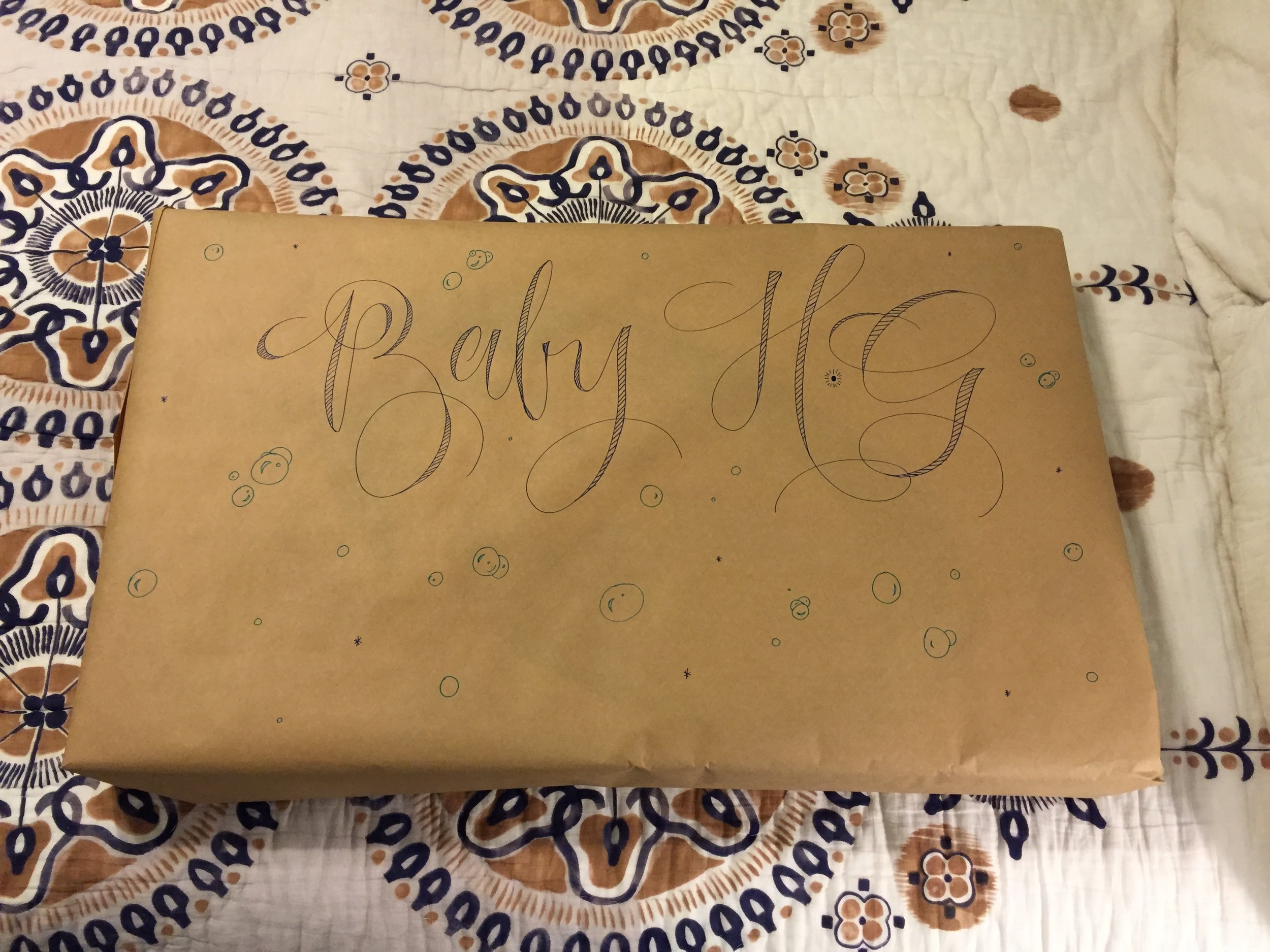
Cards are nice and all, but sometimes it's more fun to write BIG! For this large baby gift, I used markers on craft paper to personalize the wrapping with a bouncy, modern calligraphy style. I drew little bubbles all over as a hint to what was inside: a baby tub!
Seeing Red
White and red is such a crisp, classic color combination. This opaque white ink and red envelope combination is great for special occasions like Christmas cards and Valentines. It's also gender neutral, which makes it a good gift option for parents who decide to wait to find out the gender of the baby.
Sparkles!
For this envelope, I used all the sparkles. And by all the sparkles, I mean I tested the sensible limits of glitter by using both a metallic rose gold ink and a Sakura stardust pen for emphasis. Because sometimes, more is more.
Orange is the new Black
Sumi Vermillion is one of my favorite inks. It has this incredibly rich orange color and it writes like buttah. I've recently found myself more drawn to warm colors, particularly orange, even though I've never cared for the color (As a Georgia fan, orange is the no-no color of SEC rivals like Florida and Auburn). But lately, I'm starting to see orange in a new light. It's fun and cheery and really brightens up a plain white envelope, don't you think?
Fun Mail
Every day I check the mail, and I'm usually disappointed to find an assortment of catalogues, bills and credit card offers. But I always hold out hope that there will be something fun waiting for me!
That's why I'm so excited about participating in IAMPETH's (That's the International Association of Master Penmen, Engrossers, and Teachers of Handwriting) annual envelope exchange. This summer I'll be trading letters with a handful of other calligraphers around the country, and I can't wait!
There are no rules about how the envelopes should be decorated—anything goes. It's a great way to be creative and try new things. For my first envelope, I used blue and green watercolors to create a tie-dye effect and I love the way it came out! Except for the fact that I misspelled Wisconsin. Please ignore that...